A Content Strategy Guide for Higher Education Websites
An effective content strategy helps create an education website that provides reassurance and confidence to people who are considering life-changing decisions.
- What do people need to know
- What are the benefits
- Tone of voice
- Avoid information overload
- Respectful the importance and gravity
- Understand the type of website visitors
- Tell stories
- This is not just pre-launch
Please note that when I think about a content strategy, I’m not only thinking about text-based content. Most of the points below apply to text, website images, graphics and layout. If you can explain something more clearly and simply with an image or infographic than writing, then do that.
1. What do people need to know?
Often people start website content with a list of things they want to tell people to convince them of something.
If people are on your website, they don’t need heavy-handed sales style content thrown at them. They are clearly interested, and since they have not contacted you yet, they must be seeking an answer to a question.
By starting your content with what do people need to know you’ll be much more user-focused and helpful to website visitors.
To get started understanding what questions people have; you can send surveys to past and existing alumni, offer a survey chatbot or questionnaire on your site, interview users. You may have to dig deep since questions are not always obvious and can be tied to an inner fear or expectation a person has. Creating buyer personas and empathy maps can help you see the common patterns that emerge.
2. Benefits not features
Website content should focus on the user needs rather than the institution’s reputation.
“Publishing content that is self-absorbed in substance or style alienates readers. Most successful organizations have realized this, yet many sites are still built around internal org charts, clogged with mission statements designed for internal use, and beset by jargon and proprietary names for common ideas. If you’re the only one offering a desirable product or service, you might not see the effects of narcissistic content right away, but someone will eventually come along and eat your lunch by offering the exact same thing in a user-centered way.”
Erin Kissane – The Elements of Content Strategy
What is the benefit you provide to people? Is it progression, a challenge, a better career path, a fun/relaxed learning environment.
Think hard about the benefits and be honest with yourself. At first glance, you may say you offer all of the points above. What would last students say you offer? What would other institutions say sets you apart? How would I feel if I attend your campus?

If you have a newly renovated campus; speaking about the size of the campus or how much it cost is of no benefit to the person reading your website content. We need to transform from the old institutional style content into being people-centric.
Education website content needs to focus on how a modern campus benefits students, not the organisation. Does a newly renovated campus mean it has better accommodation facilities? Less walking distance between classes? Dedicated social and/or sports areas? Subsidised places to eat?
Explain how all those improvements help the student; be better rested, less stressed, have more time to focus on studies, make more friends, have more fun, have somewhere to unwind, save money eating out.
Those type of benefits helps potential students imagine themselves becoming a part of your campus. We’ll cover imagination in more detail later.
3. Tone of voice
I’ve talked to so many education professionals who say they offer a relaxed and fun learning environment, but their website content is so formal and rigid. That disconnect sends mixed messages to people.
“Mask the logo on your site. Do you sound different, unique—like yourself? Or do you sound like everyone else, including your competitors?”
Ann Handley
Offer a Better career path? Then your content has to have an upbeat, focused and aspirational tone of voice.
Interviewing current students is a great way to learn how they perceive the tone. Ask students if you can record and publish their opinion to let them advocate for your institution and convey an authentic tone of voice. This content can become testimonials, student life features, profiles, videoes that can be used frequently throughout your website and marketing channels.
4. Avoid information overload by breaking up website content
Please, please, please don’t just copy and paste a Word docs into a text box and view that as providing course information online. A Word doc is NOT a webpage.
The web is entirely different from older mediums like print. It is an interactive medium that allows us to deliver information in multiple ways to people in a back and forth manner.
Providing all the information in one go can seem daunting when people see all the work ahead of them. Too much information can cause cognitive load, overwhelming a person.
Instead of showing all the information instantly, break website content down into digestible elements and allow people to explore them section by section.
Breaking content down is also beneficial for repeat visitors who want to pick up where they left off. A big decision like attending your campus may be something a person spends a number of days, weeks or months considering; which means they may be back and forth to your website while they go through each phase of their buyer journey.
5. Respect the importance and gravity
A single course/degree/certification may be one of the hundreds you offer, but it may be the most critical point of focus for an individual. The decision they make could completely alter their future. They may have a lot of concerns and worries, which you need to offer reassurance for where possible.
Concerns will be varied and wide-ranging. Will this course deliver what I expect? What kind of job or career prospects will be available? Will I get along with the other students? What is there to do when I’m not in class?
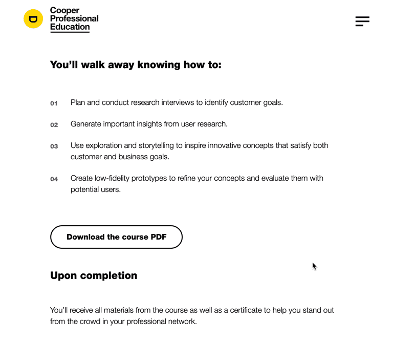
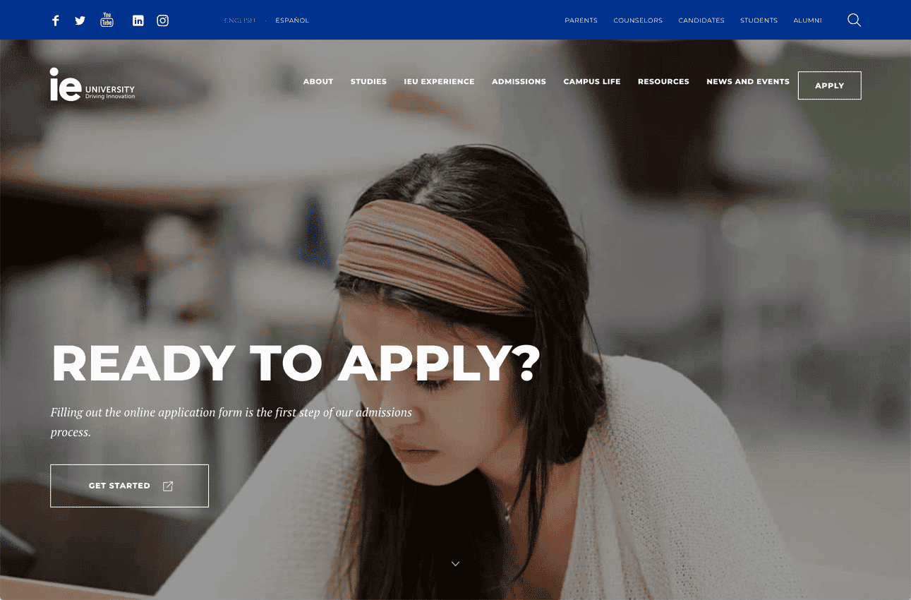
Consider different phases in a person’s journey (research, comparison, decision, attendance) and make each phase simple. Trying the hard sell to someone who is only researching right now will only frustrate them. Consider a smaller alternative step for those who are not ready to fully commit and click ‘Apply Now’. A downloadable course brochure. Also, offering a section providing links to more info helps people delve deeper when they are ready to.
You also have to factor in other people’s concerns.
6. Understand the types of website visitors
Parents will visit your site to research or to address their concerns. Career guidance officers will seek more information to give students. Companies looking for future employees may want to understand if your students will be a good fit. All these parties have different needs your website content can address.
You could take the download brochure we discussed earlier a step further. By including an option in your’ Request a brochure’ form, asking people if they are prospective students, parents, career guidance; you could send different content to each group.

7. Tell stories to capture the imagination
Imagination draws on the creative and emotional side of our brains. Reading a great book can transport us to other places with sights, sounds and vivid images. Create content that is natural and includes stories to help paint a picture.
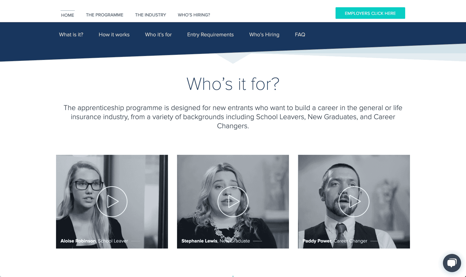
By sharing student stories and testimonials, people see someone they can identify with, helping things feel more human and connected.
Show prospective students what a typical week could look like from a students viewpoint. This helps them see what they are considering as less daunting than a 1-4 year course.

Explain what type of job opportunity they can expect, or showcase/interview the type of company that seeks students from this course or college. Students can imagine the career path they’ll take or the company they’ll join.
Different institutions have very diverse student experiences. Do students stay on campus, do they have to move home? If so, reassure them about the amenities, the student life and experience.
8. Things don’t stop after your website launches
In many projects I’ve been involved in there has been a frenzied panic to get all the content ready for a new website. This is then followed by a lull or tail off for any future content planning.
Your content strategy should factor in future content. I would recommend nominating a person to be responsible for the site content. Someone whose job it is to periodically review, add and update content where and when it’s required.
All blogs