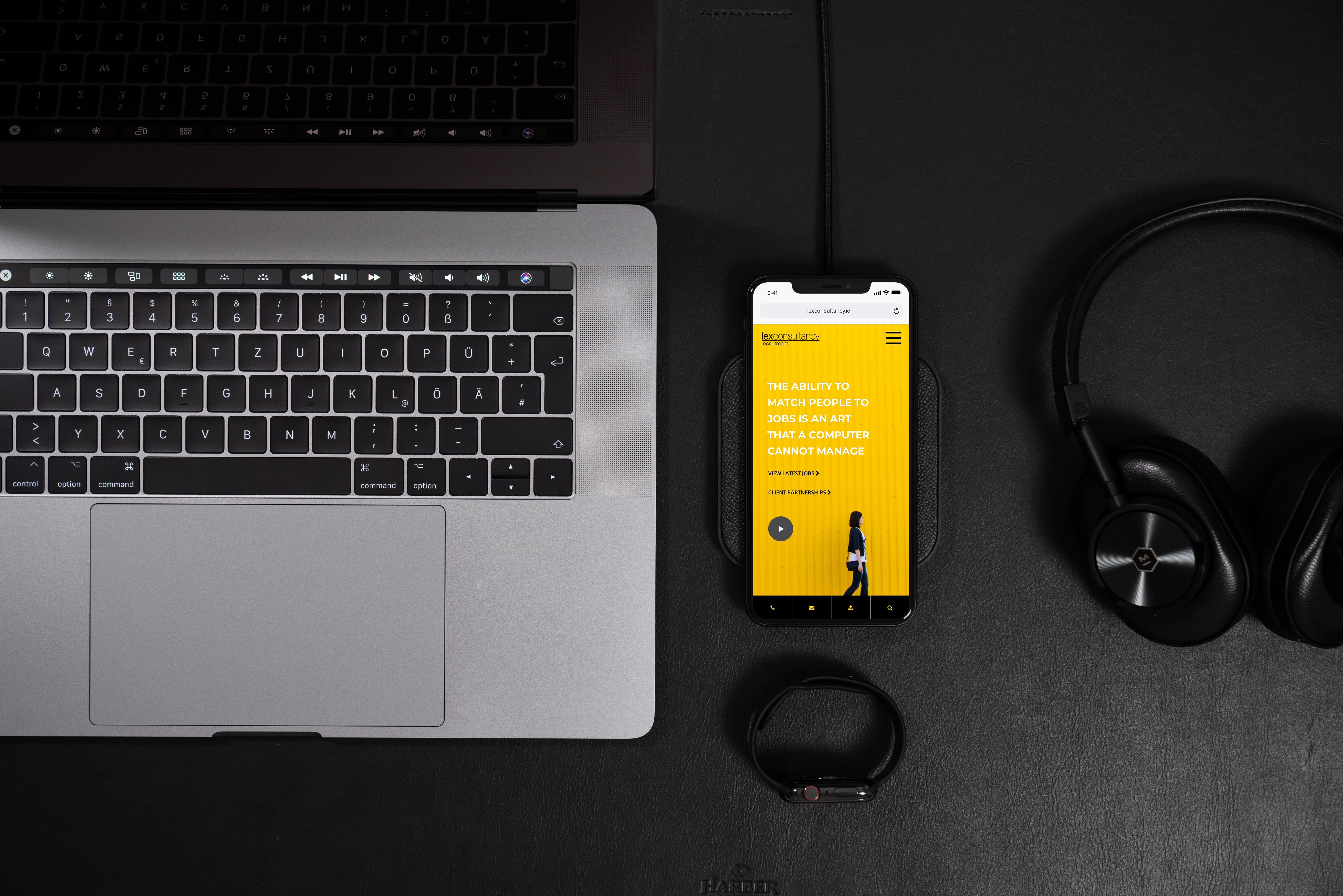
Services
Web UI & UX Design
Responsive Web Development
WordPress Development
Website Care Plan
Website Hosting
Custom Jobs Boards
Client
Lex Consultancy
Awards and Recognition
| Type | Organisation | Description |
|---|---|---|
| Winner | Web Guru Awards | Guru of the Day |
| Nomination | Awwwards | Site of the Day |
| Nomination | CSS Nectar | Site of the Day |
| Nomination | CSS Design Awards | Site of the Day |
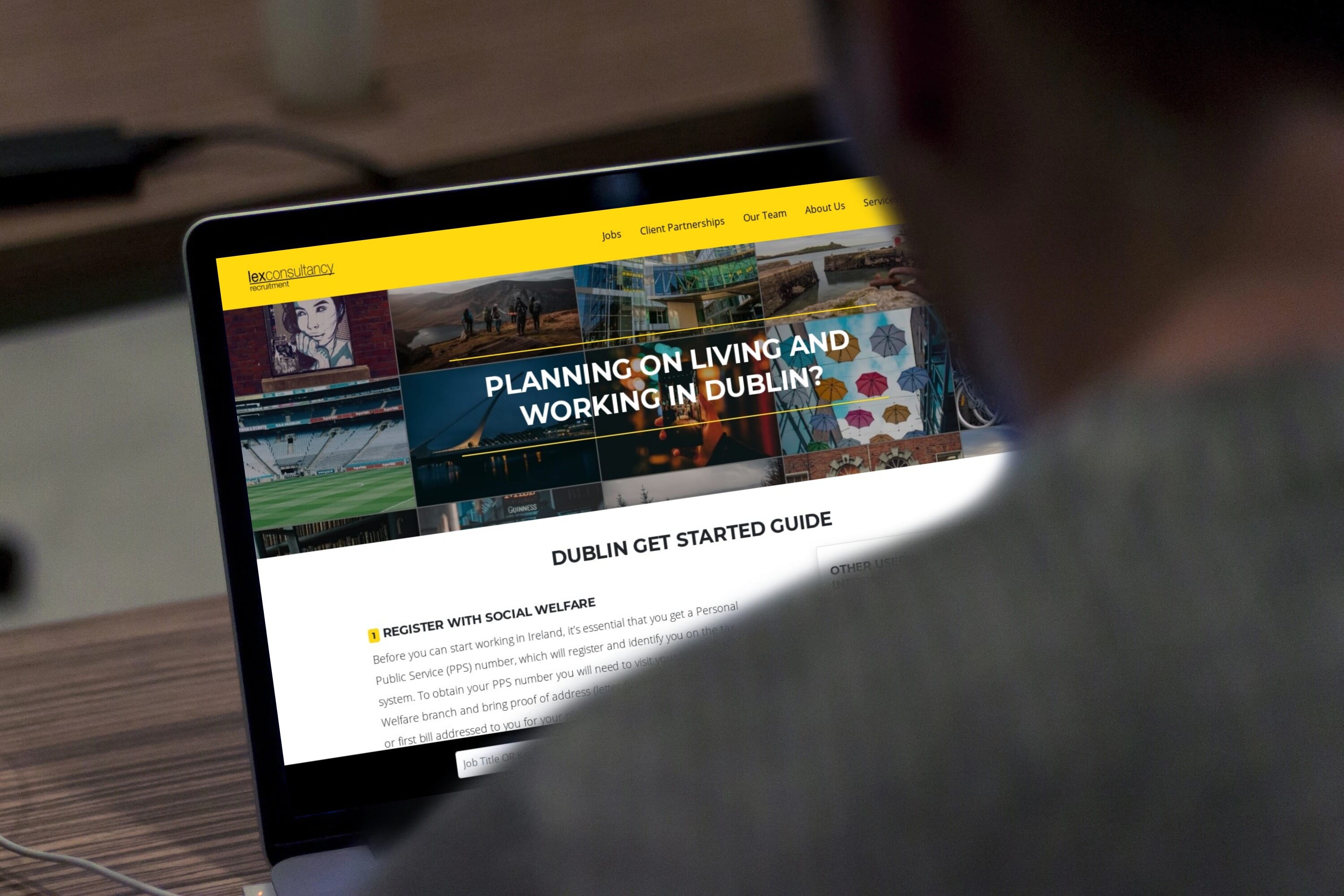
Lex Consultancy needed to create something unique and aligned with who they are and how their brand should be perceived.
Lex Consultancy, a Dublin-based recruitment agency, believes in using human experience rather than just computers to find high-performance candidates. This marks the 6th recruitment web design project for Hidden Depth. Even though we know the industry well and the balancing act of appealing to both clients and candidates, it was vital that we did not do a cookie-cutter website.
The problem
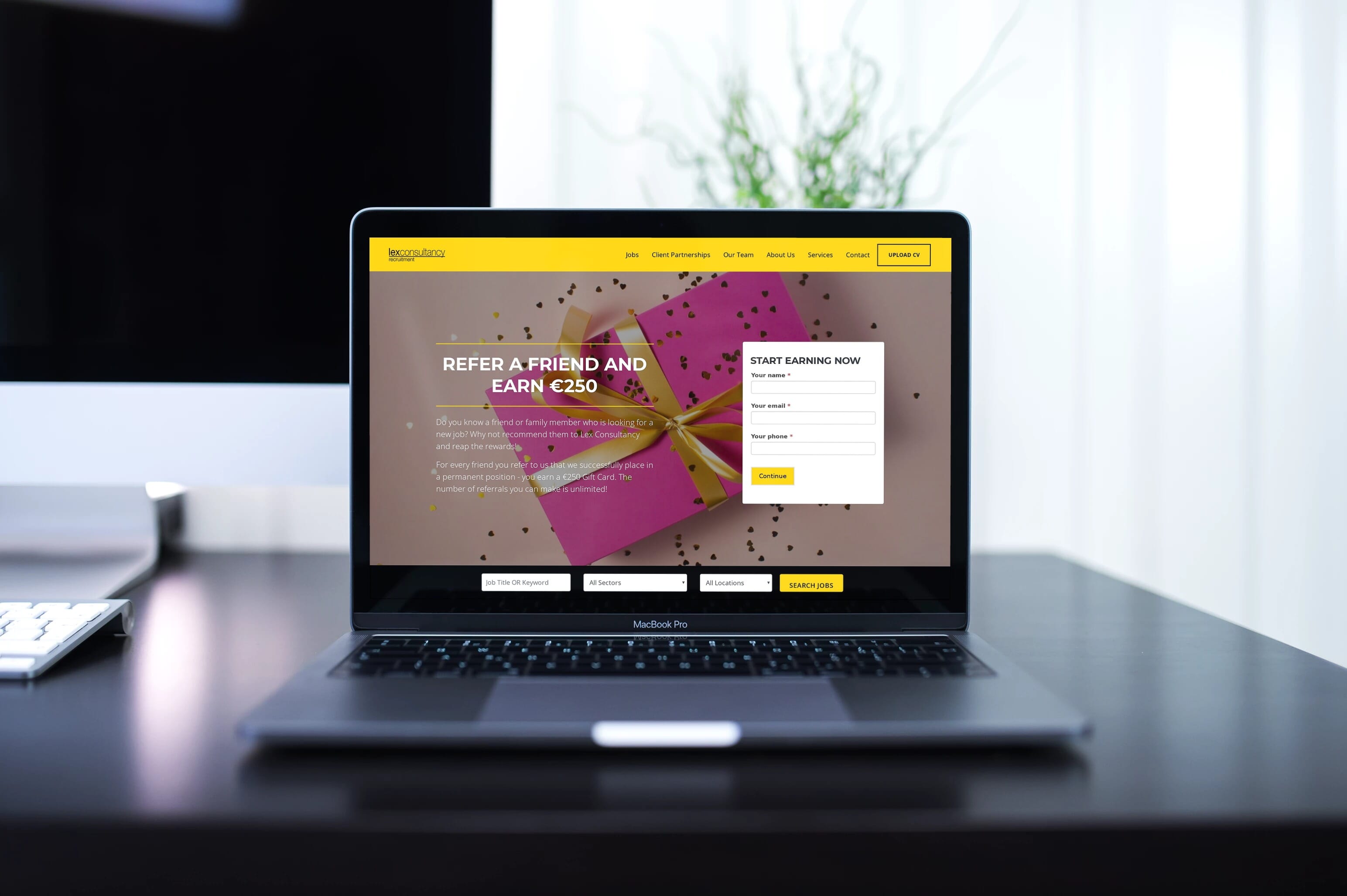
Lex Consultancy needed a recruitment agency website they could be proud of, something that would help connect them directly to clients and candidates, an online presence that would showcase the people and personality of the business.
When your recruitment agency is in a growth phase, your website and online image can end up taking a back seat. Lex faced this exact problem when we first met. The business was growing, but the website did not reflect how far the organisation had advanced in the last few years. The site lacked the personality and reassurance that people seek when looking for the right recruitment agency.
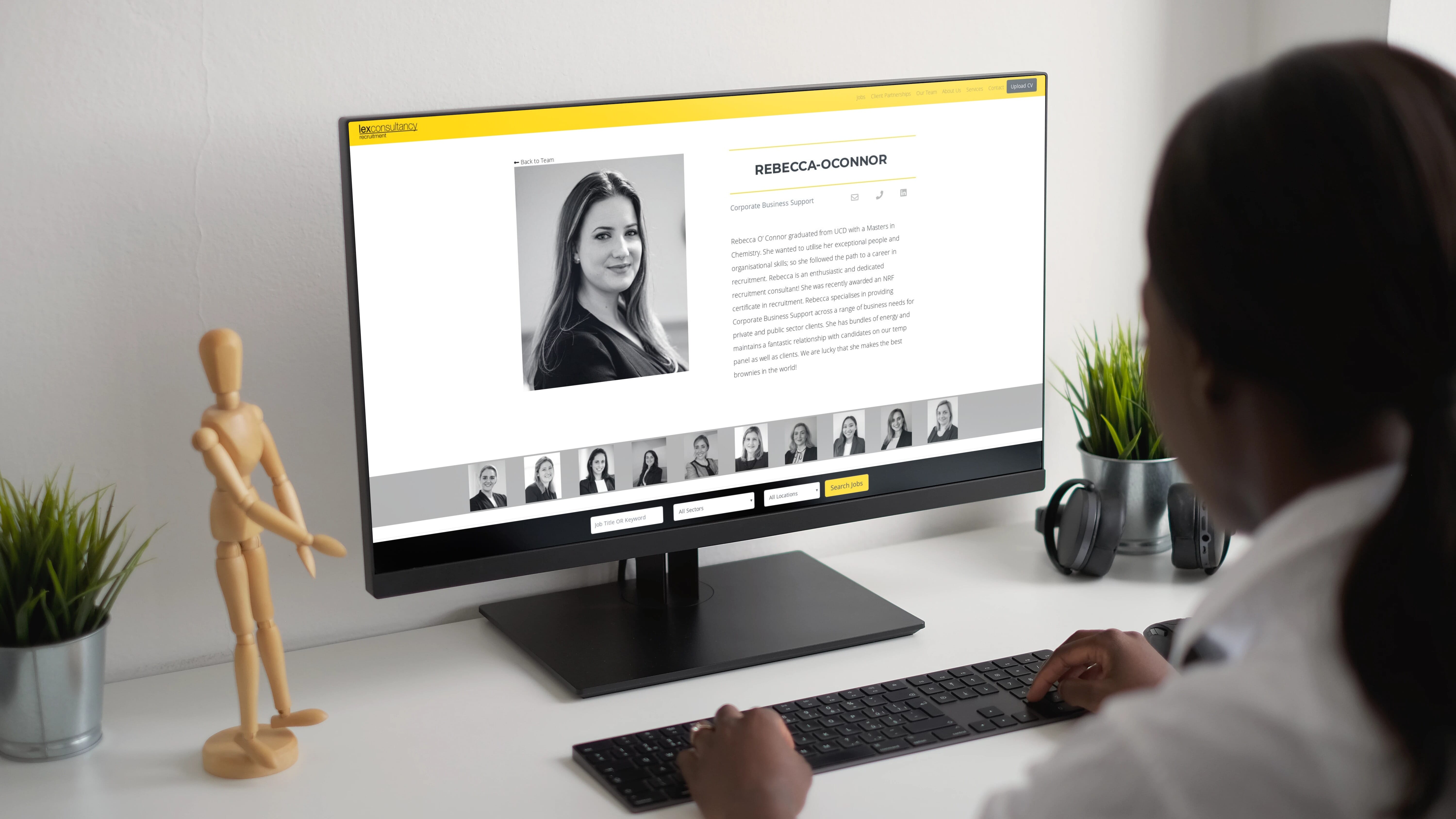
A DISCOVERY PHASE WAS ESSENTIAL
Each recruitment agency has different roles, sectors, client types and typical candidates. There is no one size fits all web design approach when there are so many variants from one recruitment agency to another.
Discovery started with us asking lots of questions to get a clear sense of who is an ideal customer for Lex. Then we delved into who the people in the company are, and the kind of experience clients and candidates receive when working with Lex.

A DESIGN THAT PROVIDES THE RIGHT REASSURANCE
A crisp, airy layout uses lots of white space and generous breathing room between sections. The extra spacing slows things down for people and allows them to relax and concentrate on one specific part at a time, rather than being bombarded with information and trying the 'hard sell'.

THE BRAND PERSONALITY MATTERS
We utilised the line from the logo throughout the design. The lines also provide a hierarchy from the yellow header being the thickest (and most colourful), then the page title, followed by the dividing lines in subsections on pages.
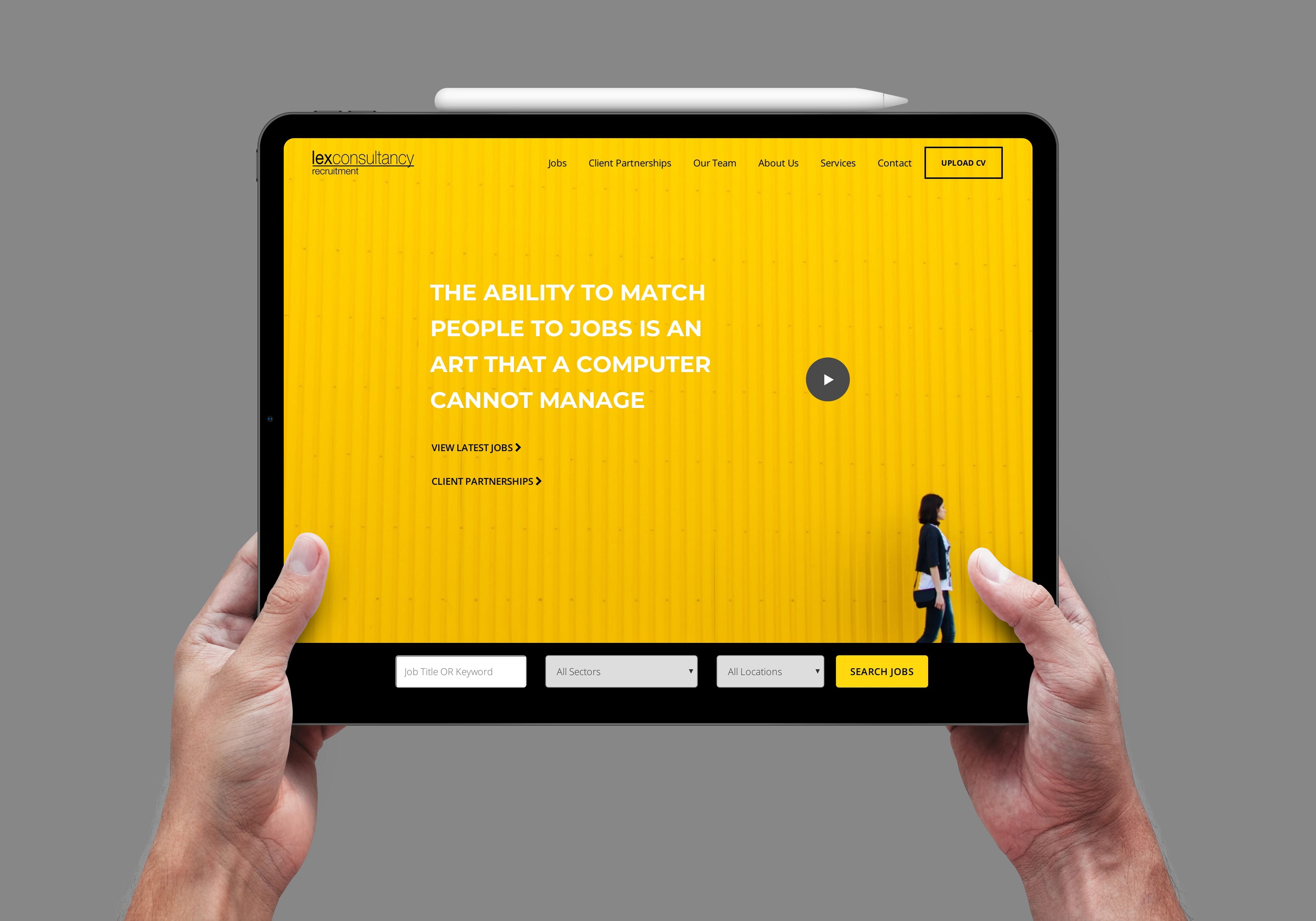
The homepage may be the first touchpoint a person has with Lex Consultancy. The quote is big, bold and proud. It sets Lex apart from the competition, which uses the common buzzwords of ‘professional, dedicated, focused, etc.’ A beautifully bright and colourful image gives the brand a unique personality and creates a memorable impact. This image can be used across other mediums (brochures, flyers, banners) to create a brand image that identifies Lex to the world. The woman who is walking highlights how Lex moves people from one place, or career path, in their life to another and creates that sense of transition and movement people seek when changing jobs.