Choosing the Right Website Images
It’s important that the website images you choose resonate with your ideal customers. The imagery should be unique and convey an emotion or message you want associated with your brand.
In most people the ability to organise and produce speech is predominantly located in the left side of the brain. The left hemisphere controls language, logic and reasoning. The right hemisphere controls creativity, intuition and expressing emotions. By not using the best imagery, or not using imagery at all, you are only appealing to the logical side of the brain. Trust and confidence are things that require intuition and emotion to be truly effective.
Images are an international language. Cavemen drew on walls long before we started to develop the complicated languages we now use. When looking at an image, the human brain can process lines, shapes, colours, form, motion, textures, patterns, direction, orientation, scale, angle, space and proportion. Text on the other hand is something that has to be taught and requires interpretation based on the context of that word in that sentence.
I’ve been involved in countless web design projects and see the benefits good imagery can make. Below is a guide to help you gauge the effectiveness of your website images.
1. Does the image resonate with your ideal website visitor?
Before you choose any images to be used on your website, brochure, flyers, etc. you need to know how your brand will speak to your audience. We all know the quote “An image speaks a thousand words”. Images can convey emotions and it’s important that you choose images that convey the right emotions you want associated with your brand. Is happiness a key emotion associated with your brand? If so are people in your images smiling, having fun or projecting happiness in some way?
Also, I would steer away from generic stock images that have no relevance to your brand or website visitors. For example: if your business is based solely in Dublin, having a background image of New York is irrelevant and will give users the wrong impression for your business.
2. Consistency breathes reassurance
People like a certain amount of consistency and predictability. Every image associated with your brand should have a consistent look and feel, similar brightness / darkness levels etc. and the images chosen should be used across all touch points (web, brochures, flyers, etc). Good branding is not about slapping a logo across everything. It’s the same feeling across each touch point and the images used will play a big role in this.
3. Consider how responsive web images will work
As responsive web design is now the norm, you must keep in mind how images will look on different devices. An image may have an impact because it dominates a large portion of the screen, but does it achieve the same effect when the screen is much smaller?
4. Are the images appropriate and in line with the experience?
Are the images appropriate for your ideal customer? For example, a sexually charged image wouldn’t be suitable for a local village florist that caters for weddings and funerals.
Do the images you’ve chosen reflect the personality of your company? Have you given users a realistic representation of what to expect from your brand? Some people use stock images of busy call centres or a shiny tech office full of people. Are those images inline with the experience clients will have when they visit your office? Trust is easy to break but near impossible to restore.
5. Match image styles to emotions
Do you want to build excitement about your product or service? Use vibrant images with motion, action shots, strong colours.

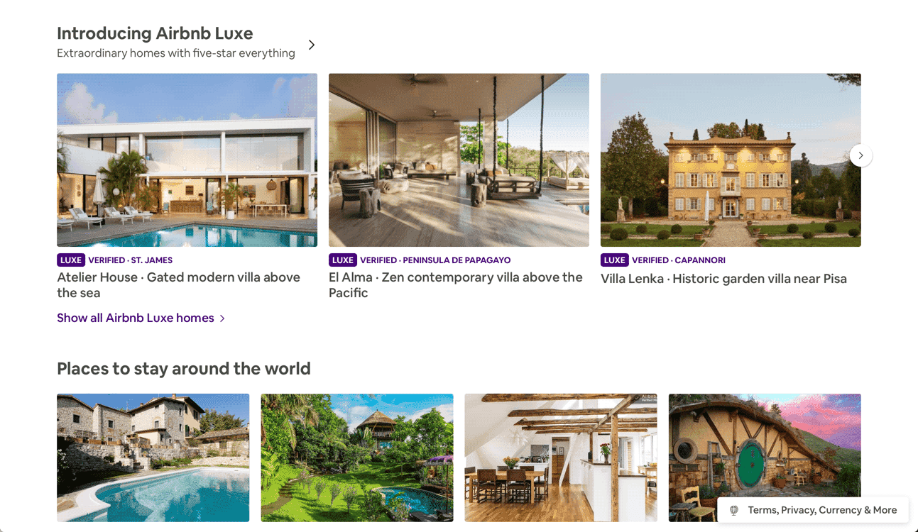
AirBnb use nature and natural light to add an authentic feel
Want to provide reassurance and a sense of calm control? Use nature-based images, take your team profile shots outdoors, choose bright warm tones.
6. Images are not a substitute for poor website content
Humans for most of our existence have had to look out for threats. The threats are just different in the modern world. We look to protect ourselves against people who can’t be trusted, people who won’t give us what they promise. When something doesn’t look or feel right there is a protective part of our brain steering us away from those things.
The images you choose will set the tone and personality of your brand, but if the content isn’t up to scratch, then people won’t stay engaged. Images at the top of webpages are effective for setting the initial tone but make sure your content compliments and build upon those feelings.
Good imagery won’t make up for bad content and bad imagery will have a negative impact on good content. Great content and great images that compliment one another will make your website shine.
7. Make images the right size
It’s important that you choose the right size image. If you choose an image that’s too small, it will appear blurred and if the image is too big, it will have an impact on website load speed. The image size of a photo taken on a smartphone is approx. 15-20 times larger than required for most website images.
There are a ton of free image resizing websites that are easy to use and will create web optimised images for you. My favourites are tinyjpg and BulkResizePhotos. For WordPress websites, there are plugins like Imsanity to reduce image file size automatically when you upload a new image.
I’ve recently been testing our Sirv which handles image storage and will automatically serve website visitors with the correct size image their device needs. Paul Boag’s article does a superb job of explaining the benefits of Sirv.
8. First Impressions Count
Choosing the right image in the right place is extremely important. This might be the only time a user will interact with your brand before making a decision to choose your business or a competitor’s. It’s important that the first few seconds they interact with your brand gives them a lasting, positive association with your brand. It doesn’t matter if you have the greatest product in the world, if you present it poorly, people will create that association with your brand.
9. Different webpages require different image styles

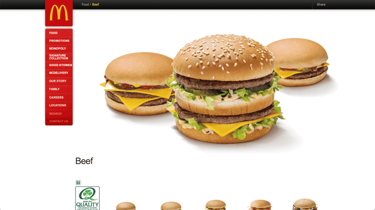
Good images allow people to increase the value perception of your product or service. Most people eat McDonald’s burgers, but do the burgers ever match the imagery seen on their website?

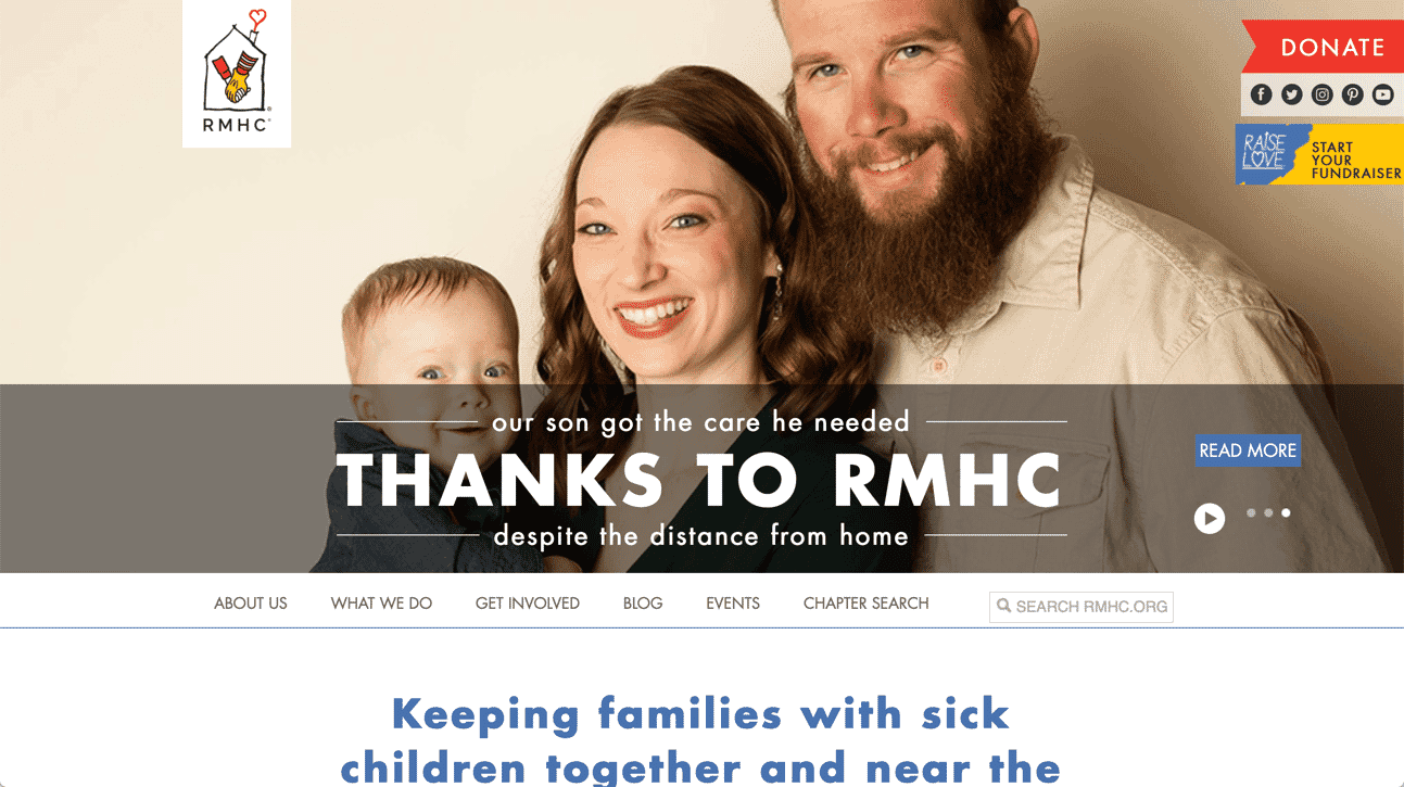
But then take a look at their charity page, the imagery is totally different, it’s the same company but they know how to choose the right imagery to convey the right emotions and reflect the goals of each website. You don’t need to employ a professional photographer, you just need to spend the time choosing the right images and make sure they reflect your brand properly.
Find good website images
If you’re having difficulty finding the right images, we recommend having a look through these websites, they might just have what you’re looking for:
All blogs