How to design a course search feature that actually works
In theory, a user will type a search term and find the exact course they need. In practice, website search is a much more tricky feature to master. Poorly executed search can create a bad user experience. First impressions, which needs to reassure and show you’re easy to deal with, can be influenced for good or bad based on your website search.
As UX Booth explains, “Users expect smooth experiences when searching, and they typically make quick judgments about a services value based on the quality of one or two sets of search results .”
There is no one size fits all approach to adding search to your education website. But some methods are better suited to education providers.
Do you need a website course search option?
Consider how much content is available for people to search. If your website has a small number of pages (under 30 courses), then the search option may be overkill for your requirements. It would be better to design a better navigation system, add internal links to relevant categories or create a course index page.

Understanding search capabilities and requirements
What content are people searching on your website?
Before we delve into the different website course search options, let’s consider what type of content people will be searching.
For education websites, people will typically be interested in searching for a list of available courses. Course may be categorised in some way (part-time, full-time, area of study). There could be multiple instances of courses with slight differences (same name but part-time or full time or different enrolment dates).
You may be tempted to add all pages on your website to your search index; with the view to making all information available from a search query. I would advise against this as those other pages can dilute the search quality and make more work for users to find what is relevant to them.
If you visit Amazon’s website and search for a product, would you expect to also see results for their news articles, press releases, company structure?
A search feature must be relevant to the user’s intended goal. If students are searching for a course, don’t confuse them with other webpages in the search index and results.
What type of content will be indexed by search?
A vital factor for reliable search is precision. If I search for ‘engineering’, does the search find all mentions of the term ‘engineering’ within the continent of pages or just pages with that title?
By default, WordPress only searches page titles and post content. Custom WordPress websites can have extra content areas that all not part of the default index. These sites will need to use a search plugin like Relevannsi to add additional types of content to the search index.
Creating a course search feature that delivers accurate results
1) Avoid text input for course search
Text or keyword input is the most common search option everyone is used to. You type a word or words into the search box and hit enter. It’s a simple approach for users but complicated for search systems to deliver the correct results.
Search words are subjective. Imagine you added a listing to your website for a ‘hairdressing’ course. A user visits your website and searches for a ‘barbering’ course, which shows no results. They leave thinking you do not have what they need.
If the search returns incorrect results for search phrases, users can quickly become frustrated.
There is already a high expectation of text input search. People are used to ‘Googling it’, and most of the time they find what they want.
Google’s search algorithm understands synonyms and misspellings and is continuously learning. Smaller websites won’t have the power of Google to help. Relevanssi and other WordPress search plugins let you create synonyms. This is a manual process that will require a lot of groundwork, plus constant measuring of future search queries.
If your search results are going to be hit and miss, then I’d advise against implementing text input for search on your website.
2) Search by categories instead

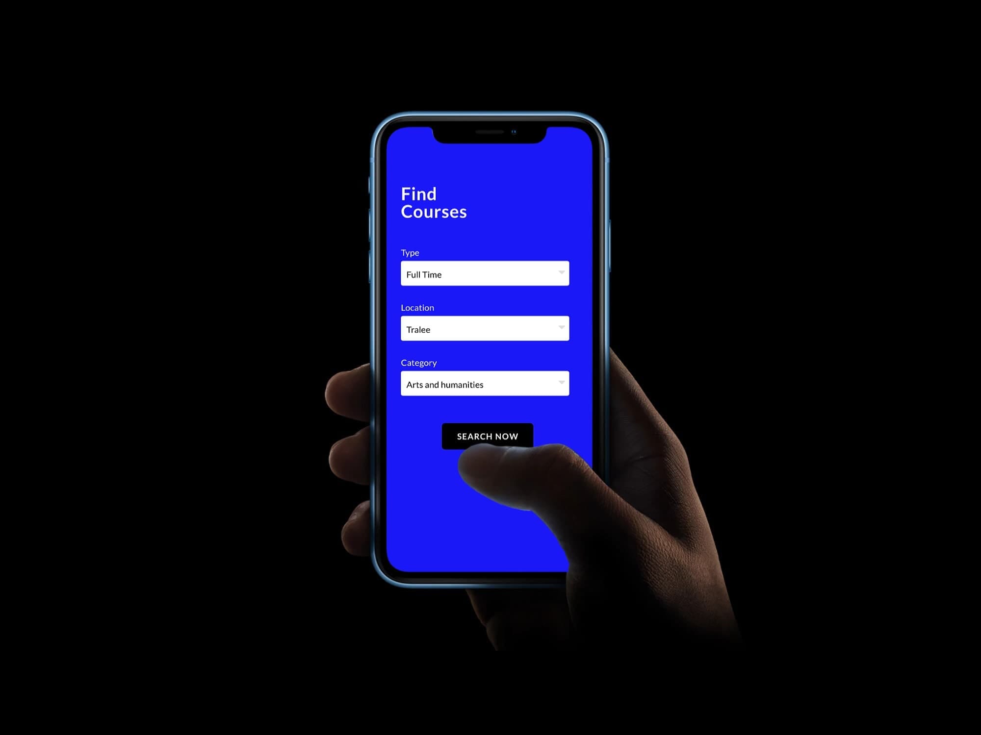
Searching by category is a better approach than text input because there is no grey area. Providing users with a dropdown list of categories shows exactly what category types your courses fall under.
Categories can also be combined to help people drill-down in their search.
Some ideas for category types:
- Delivery type (part-time, full-time, evenings, online)
- Subject/sector (marketing, sales, law, beauty,)
- Location (Dublin, Carlow, Kerry, Galway)
- Degree (graduate, post-graduate, masters)
Categories also avoid additional work for the people using the site CMS. Once a course is added to a group/category, it will become available within the search system. If no courses are using a specific category; that category won’t appear in the search dropdown. This means precise and predictable results.
Keep search categories to a minimum
You know how your courses are structured and your organisation’s unique categorisation system. You may hope that providing lots of filters would make the search easier for people. This is a noble goal, but you must also consider the cognitive load adding more choice can put on users.
When a user is working on a task, relevant information and processes are stored in their working memory. This information must be processed, and the amount of mental resources required to do so is known as cognitive load. As the brain has a limited amount of processing power, too much information delivered in too short a time can increase cognitive load to a point where it overwhelms the user.
With increased distractions, particularly from cell phone use, students are more prone to experiencing high cognitive load.
Wikipedia – Cognitive Load
Google offers eight search filters for the millions of search results they return. Facebook has six icons at the bottom of their screen to navigate their entire app. Instagram has five. Twitter has four. These companies understand how simplicity can help to avoid overwhelming people and create a better user experience.
Most education websites only require 2-3 search filters to allow users to find the right course for them. People tend to search by the type, location and area of study.
Always remember that prospective students are visiting the websites of your competition too. You want your first impression to feel effortless and reassuring, to help set you apart. If your website feels like the most detailed and complex, then that is going to be the brand perception people have while they consider applying for your courses.
All blogs